PROJECTS Retail
Anzelha Jewelers, Chicago, IL
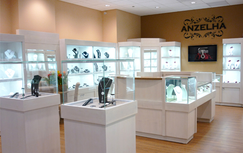
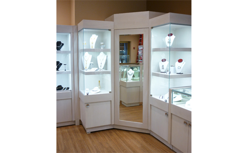
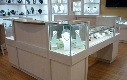
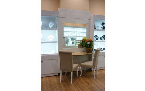
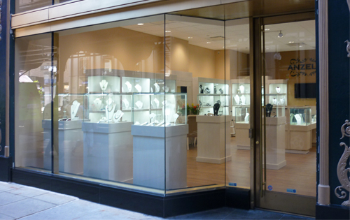
Anzelha Jewelers is located in the Palmer House Hotel on Chicago’s Jeweler’s Row on Wabash Street. The simple and elegant design features custom modular casework with internal LED illumination that highlights the jewelry within. The compact 700 SF space is comprised of one open room with all stock storage ingeniously self-contained within the casework or in hidden storage closets located behind touch release mirrored doors. Materials and lighting have been selected for ease of maintenance, sustainability and energy efficiency.
Anzelha Jewelers, Chicago, IL
Anzelha Jewelers is located in the Palmer House Hotel on Chicago’s Jeweler’s Row on Wabash Street. The simple and elegant design features custom modular casework with internal LED illumination that highlights the jewelry within. The compact 700 SF space is comprised of one open room with all stock storage ingeniously self-contained within the casework or […]
GALLERY
The Goddess & Grocer, O’Hare International Airport
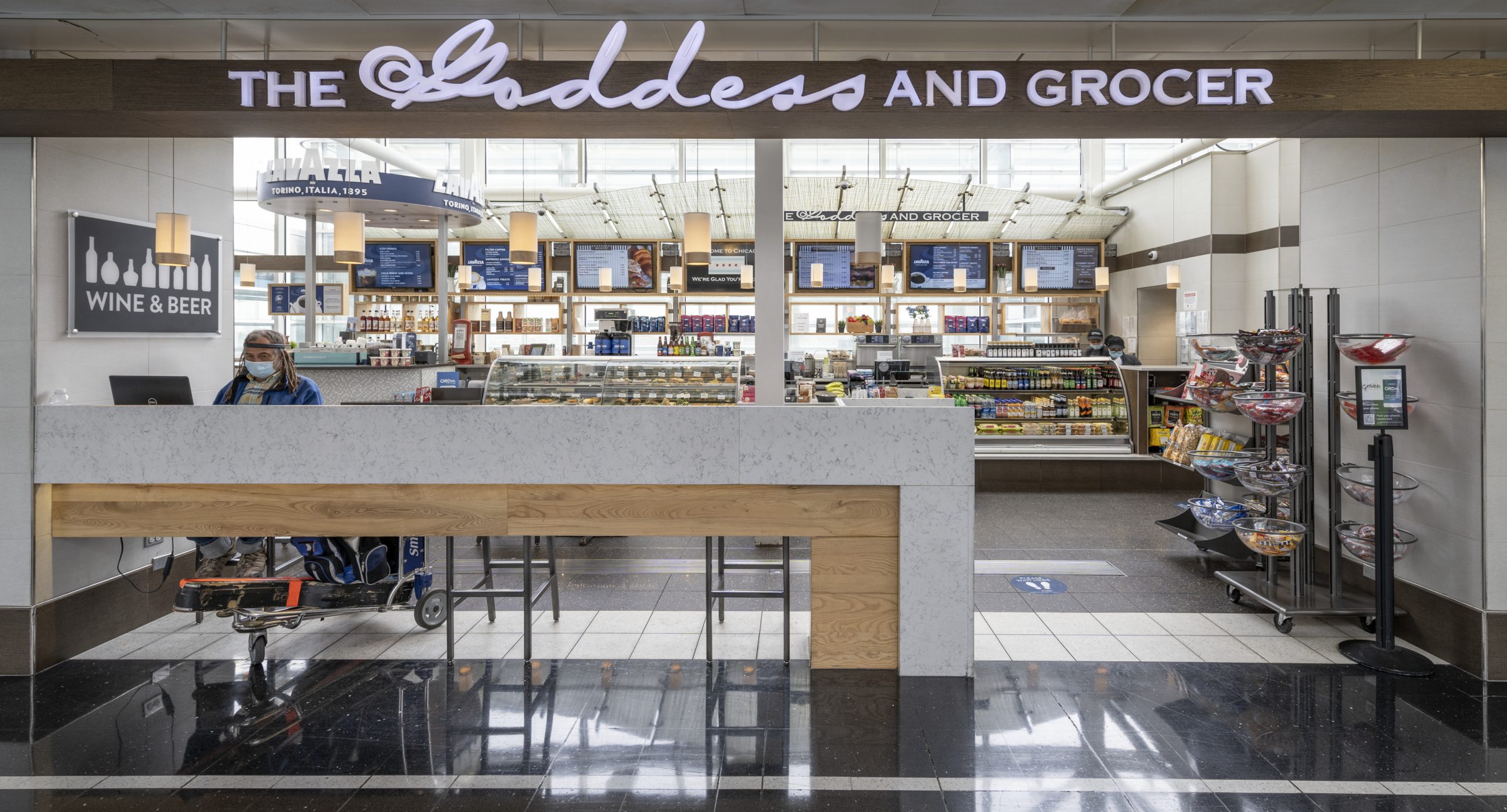
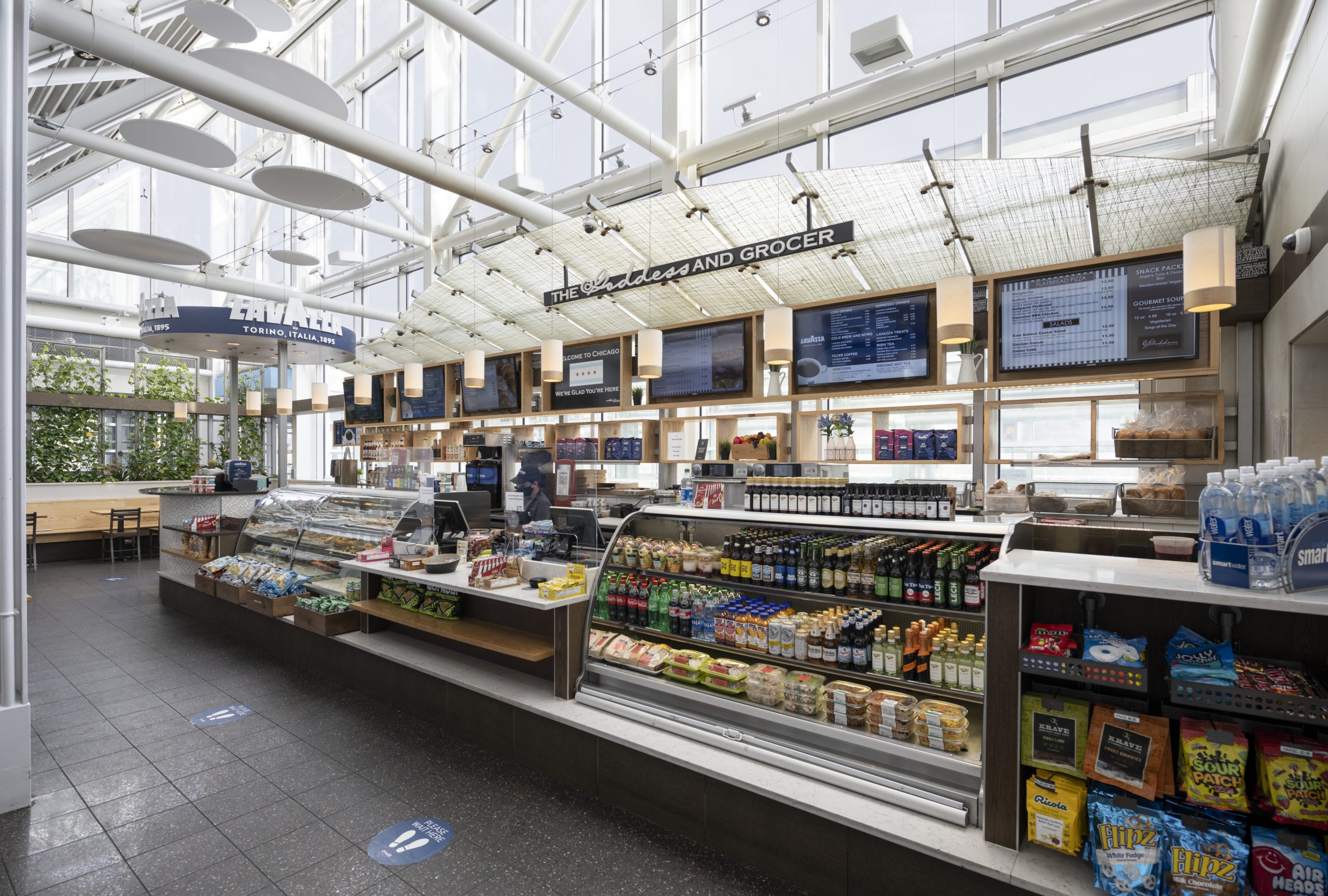
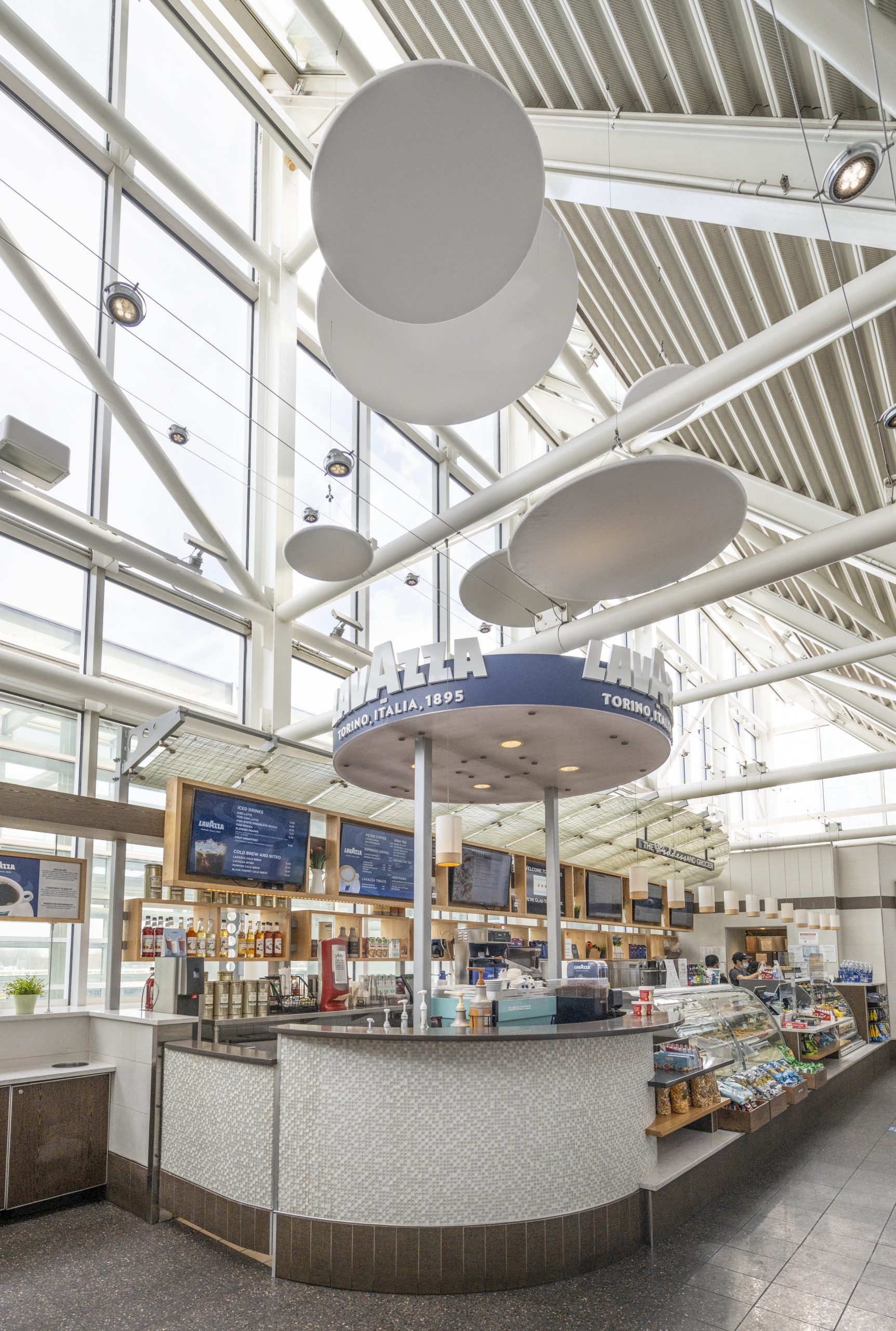
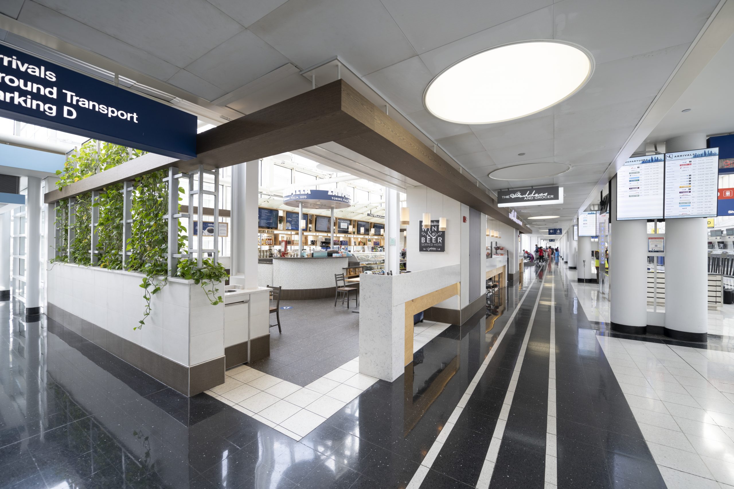
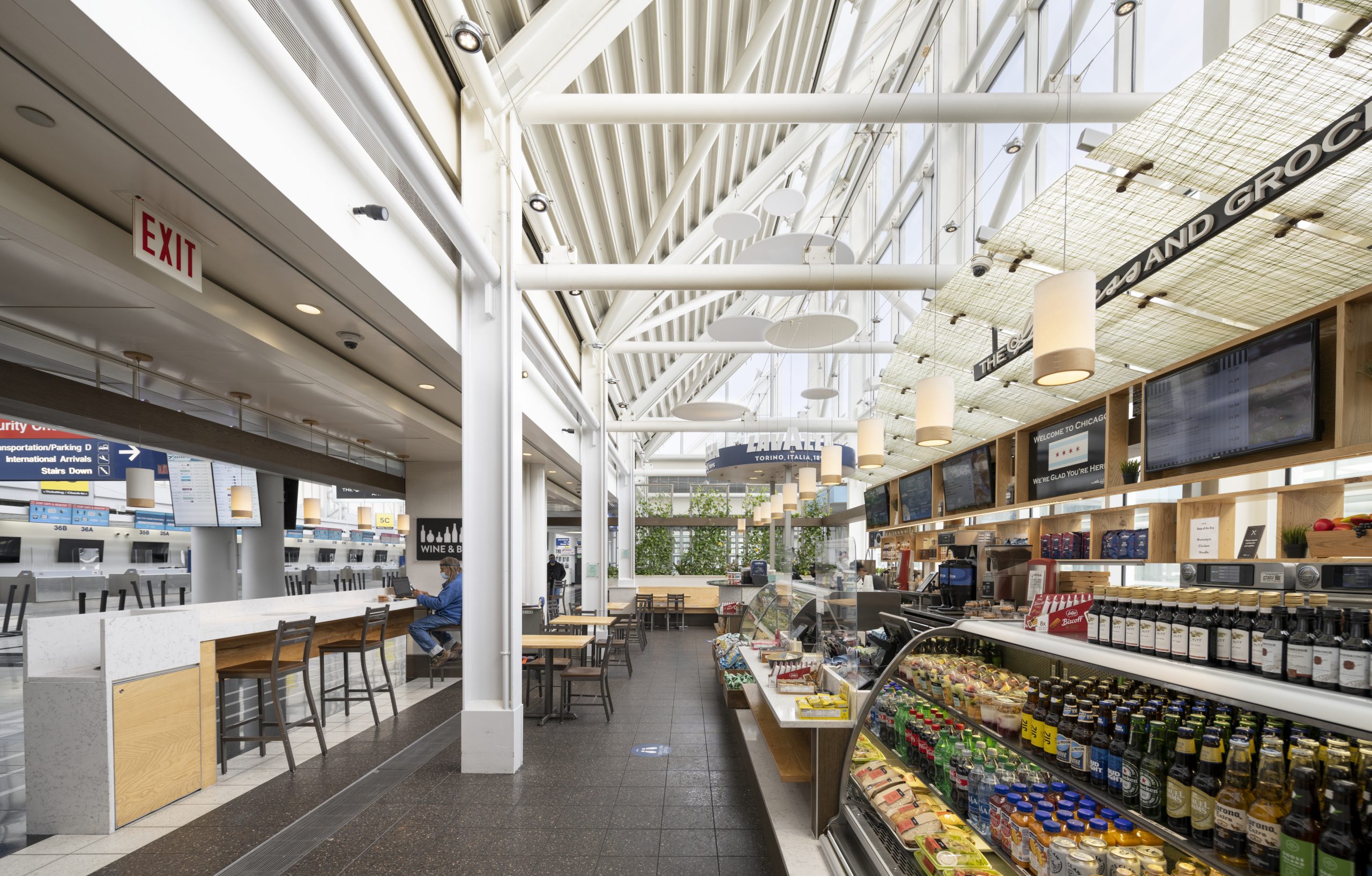
The Goddess & Grocer at O’Hare’s international terminal, is a locally-owned artisanal deli and market developed in conjunction with Chicago’s Metropolis Coffee Company. Prominently located prior to security, the compact design of this space maximizes 1,600 square feet to elegantly merchandise pre-made and made to order food options, custom prepared coffee beverages, snacks, plus wine and beer, while still accommodating seating for 32 patrons. This open concept combines materials such as recycled wood, with an earthy, yet refined color palette. A living plant wall/herb garden provides a whimsical and organic touch, while the high glass atrium above ensures plenty of natural light. A translucent floating canopy and suspended fabric sculptural elements provide additional visual interest. The combined effect results in a pre-departure oasis, serving the international traveler in an energetic and airy space.
The Goddess & Grocer, O’Hare International Airport
The Goddess & Grocer at O’Hare’s international terminal, is a locally-owned artisanal deli and market developed in conjunction with Chicago’s Metropolis Coffee Company. Prominently located prior to security, the compact design of this space maximizes 1,600 square feet to elegantly merchandise pre-made and made to order food options, custom prepared coffee beverages, snacks, plus wine […]
GALLERY
I Love Chicago, O’Hare International Airport
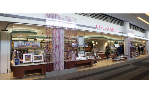
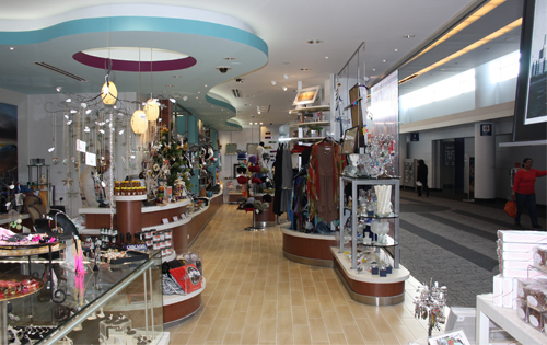
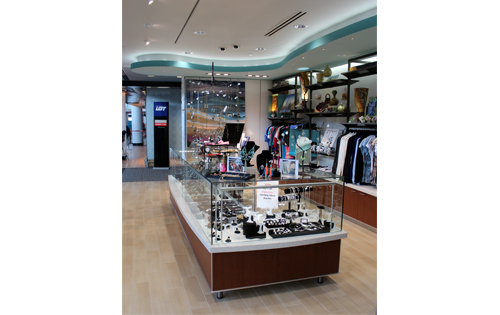
Floor to ceiling glass panels with embedded flowing ribbons of color frame the exterior of this retail venue that features the best of Chicago’s artisans at O’Hare Airport’s International Terminal. Within the store, the translucent backlit focal wall with color changing illumination provides energy and excitement to draw customers into the store. White sculpted walls and an undulating soffit that mirrors the shape of the counters below provides the backdrop for one of kind paintings, sculptures, and handmade jewelry. Casework and displays feature materials made with real wood, sea shells and recycled glass that bring an element of nature that ties in with the overall organic feel of the retail environment.
I Love Chicago, O’Hare International Airport
Floor to ceiling glass panels with embedded flowing ribbons of color frame the exterior of this retail venue that features the best of Chicago’s artisans at O’Hare Airport’s International Terminal. Within the store, the translucent backlit focal wall with color changing illumination provides energy and excitement to draw customers into the store. White sculpted walls […]
GALLERY
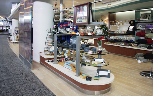
Get Snacked
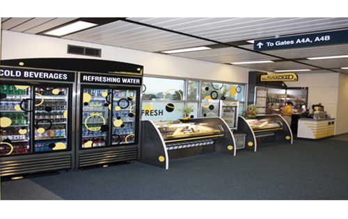
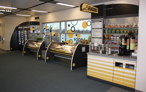
“Get Snacked” is a grab-and-go food service retail kiosk featuring packaged food and beverages located on Concourse A at Chicago’s Midway Airport. Standard refrigerated merchandisers and custom casework are trimmed with bright colors, bold shapes and signage. Corian faced rear and side wall backdrops with matching graphics are coordinated pendant lighting to create a visual frame which defines this simple and elegant space.
Get Snacked
“Get Snacked” is a grab-and-go food service retail kiosk featuring packaged food and beverages located on Concourse A at Chicago’s Midway Airport. Standard refrigerated merchandisers and custom casework are trimmed with bright colors, bold shapes and signage. Corian faced rear and side wall backdrops with matching graphics are coordinated pendant lighting to create a visual […]
GALLERY
Next Door, Chicago, IL
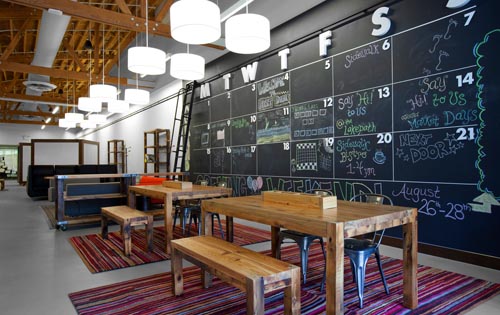
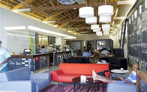
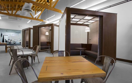
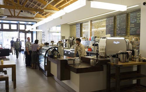
Sarfatty Associates partnered with State Farm to create a community space and café where anyone could ask questions about finances and insurance and get some answers. The result is a casual neighborhood hangout and educational center, where neighbors can speak with financial advisors and fuel up on great local coffee. Everything offered at Next Door is free except the coffee.
Next Door, Chicago, IL
Sarfatty Associates partnered with State Farm to create a community space and café where anyone could ask questions about finances and insurance and get some answers. The result is a casual neighborhood hangout and educational center, where neighbors can speak with financial advisors and fuel up on great local coffee. Everything offered at Next Door […]
GALLERY
Food Court 2012 Proposal, Midway International Airport
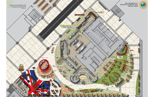
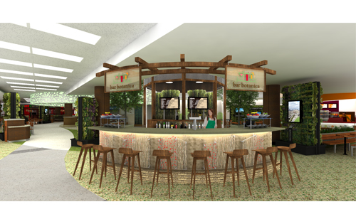
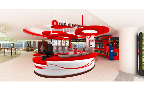
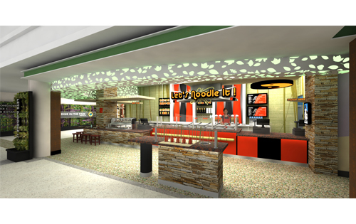
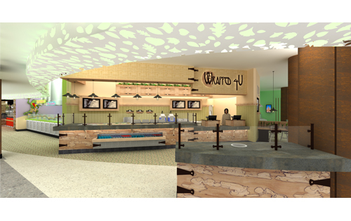
The “Dine in the Park” food court proposal offers a visionary culinary destination within Chicago’s Midway Airport. This integrated concept provides travelers with diverse food and beverage offerings, set in a park environment, reflecting Chicago’s rich tapestry of ethnic neighborhoods united with each other through the city’s extensive system of parks. Since Chicago’s incorporation in 1837, the city seal has borne the phrase Urbs in Horto translating from Latin as “City in a Garden.” Many of Chicago’s “Emerald Necklace” of parks were designed by such notable landscape architects as Frederick Law Olmstead and William Le Baron Jenney.
Walls of live plantings, accented by video displays featuring current and historic views of Chicago’s parks, are strategically placed throughout the concept. Further enhancing this parklike atmosphere are trees, flower boxes, streetlights with hanging planting baskets, a cascading waterfall, and a koi pond. A hydroponic herbarium will feature herbs and vegetables that will be grown and harvested for use in the surrounding restaurants. Not only aesthetically pleasing, these plants and indoor water features have been shown to improve indoor air quality. Finally, to stimulate the mind, one end of the food court will showcase a museum-quality informational wall telling travelers the stories of Chicago’s most beloved parks.
Food Court 2012 Proposal, Midway International Airport
The “Dine in the Park” food court proposal offers a visionary culinary destination within Chicago’s Midway Airport. This integrated concept provides travelers with diverse food and beverage offerings, set in a park environment, reflecting Chicago’s rich tapestry of ethnic neighborhoods united with each other through the city’s extensive system of parks. Since Chicago’s incorporation in […]
GALLERY
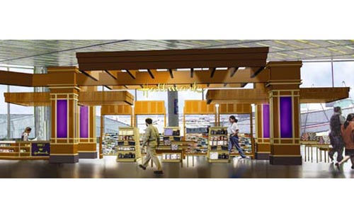
Viva’s Hallmark Kiosk, O’Hare International Airport
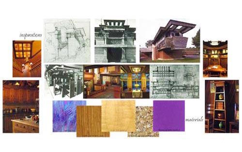
This unique 400 SF prototype kiosk is proposed for a location near Terminal 3 at O’Hare Airport. Inspired by Frank Lloyd Wright’s Chicago Prairie Style of Architecture, this “open” plan edifice attracts people from every direction. The trellis style roof structure with wide sweeping overhangs defines the space and merchandising areas while maintaining nearly unobstructed views to the airfield.
Viva’s Hallmark Kiosk, O’Hare International Airport
This unique 400 SF prototype kiosk is proposed for a location near Terminal 3 at O’Hare Airport. Inspired by Frank Lloyd Wright’s Chicago Prairie Style of Architecture, this “open” plan edifice attracts people from every direction. The trellis style roof structure with wide sweeping overhangs defines the space and merchandising areas while maintaining nearly unobstructed […]
GALLERY
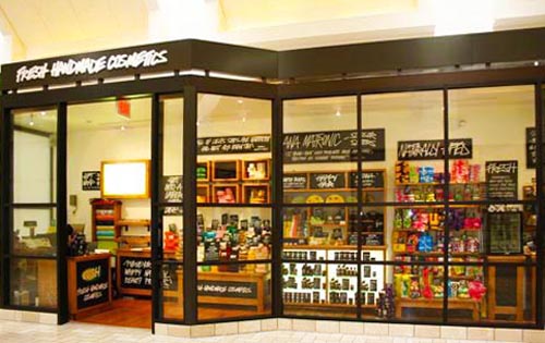
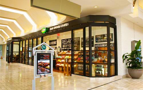
Lush Cosmetics, Tyson’s Corner, VA
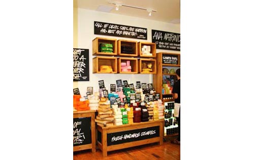
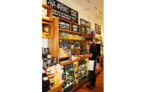
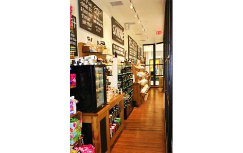
This retail space located in a mall in Tyson’s Corner, VA, is nearly sixty-six feet long by only five feet in depth. The challenge was to create a successful retail space out of un-useable excess mall width. The visually open glass storefront serves as both a display window and the means to secure the space when closed. The transparent design allows Lush’s merchandising to showcase a vast array of fresh, handmade bath and body products that literally sell themselves.
Lush Cosmetics, Tyson’s Corner, VA
This retail space located in a mall in Tyson’s Corner, VA, is nearly sixty-six feet long by only five feet in depth. The challenge was to create a successful retail space out of un-useable excess mall width. The visually open glass storefront serves as both a display window and the means to secure the space […]
GALLERY
H2O+ Sea-derived Skincare, Chicago, IL
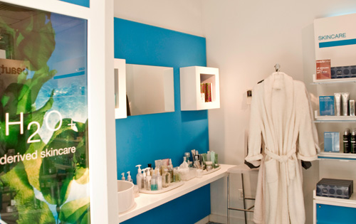
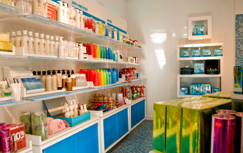
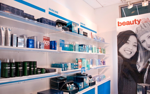
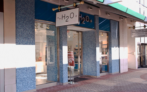
Royal Promotions Group, a product display & fixturing company, turned to Sarfatty Associates to provide architectural and MEP design services for this cosmetics brand in three Chicago locations. The store is designed along minimalist lines using a white & blue theme to let the products “pop” and make their own statement. In addition to display fixtures which occupy most of the floor area each store includes a spa niche for customers to sample products. The sea theme is carried throughout the store, from the bold use of blue on interior fixtures to glass mosaic cladding on the façade.
H2O+ Sea-derived Skincare, Chicago, IL
Royal Promotions Group, a product display & fixturing company, turned to Sarfatty Associates to provide architectural and MEP design services for this cosmetics brand in three Chicago locations. The store is designed along minimalist lines using a white & blue theme to let the products “pop” and make their own statement. In addition to display […]
GALLERY
Mixed Use Building, Skokie, IL
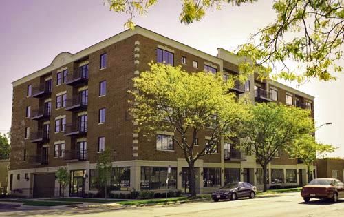
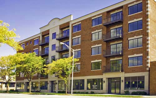
This new five story thirty unit condominium building has indoor parking and three retail spaces on the ground floor. Sarfatty Associates took this project from initial feasibility studies, through design, zoning, and construction. A significant challenge for this project was to maximize the floor-area ratio, the height of the building and the number of units in order to achieve financial viability with affordable two bedroom units.
Mixed Use Building, Skokie, IL
This new five story thirty unit condominium building has indoor parking and three retail spaces on the ground floor. Sarfatty Associates took this project from initial feasibility studies, through design, zoning, and construction. A significant challenge for this project was to maximize the floor-area ratio, the height of the building and the number of units […]
GALLERY
Illinois Tollway Kiosks
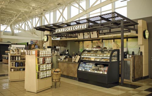
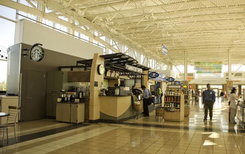
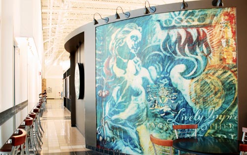
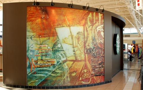
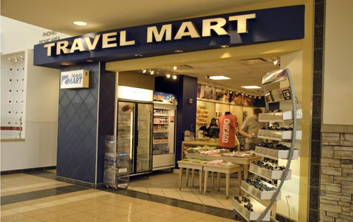
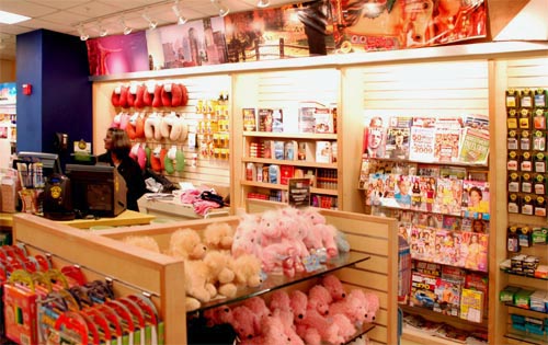
The complete renovation of seven travel oases into open plan multi-tenant retail and food service buildings required unique solutions. Each site has a freestanding Starbucks kiosk and an in-line travel mart selling souvenirs, clothing, books, pre-packaged snacks, candy, bottled beverages, newspapers and magazines. Since most of the sites are built on existing bridge decks over the tollway, we have utilized signage that is visible from both inside the building and to passing motorists through glazing that spans the highway.
Illinois Tollway Kiosks
The complete renovation of seven travel oases into open plan multi-tenant retail and food service buildings required unique solutions. Each site has a freestanding Starbucks kiosk and an in-line travel mart selling souvenirs, clothing, books, pre-packaged snacks, candy, bottled beverages, newspapers and magazines. Since most of the sites are built on existing bridge decks over […]
GALLERY
Ethan Allen Furniture, Skokie, IL
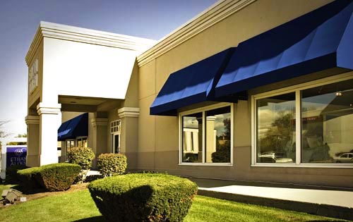
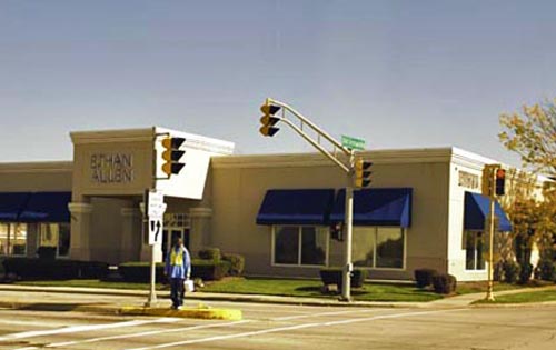
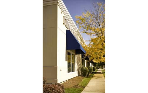
When Ethan Allen Furniture decided to change their image as a “traditional style furniture” retailer in 1993, they decided to re-concept their brick façade Georgian architectural style exteriors into something more classic. We designed and detailed a “new look” exterior using a stucco like finish system. As a result of careful detailing and monitoring of the installation of the finish system, the exterior of the building still looks new after nearly fifteen years. The construction process of re-facing this 15,000 SF building took two months while the store remained open for business.
Ethan Allen Furniture, Skokie, IL
When Ethan Allen Furniture decided to change their image as a “traditional style furniture” retailer in 1993, they decided to re-concept their brick façade Georgian architectural style exteriors into something more classic. We designed and detailed a “new look” exterior using a stucco like finish system. As a result of careful detailing and monitoring of […]
GALLERY
